tplot
tplot is a Python package for creating text-based graphs. Useful for visualizing data to the terminal or log files.
Features
Scatter plots, line plots, horizontal/vertical bar plots, and image plots
Supports numerical and categorical data
Legend
Unicode characters (with automatic ascii fallback)
Colors
Few dependencies
Fast and lightweight
Doesn’t take over your terminal (only prints strings)
Installation
tplot is available on PyPI:
pip install tplot
Examples
Basic usage
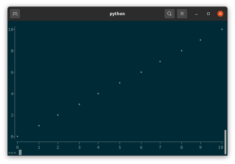
import tplot

fig = tplot.Figure()
fig.scatter([0, 1, 2, 3, 4, 5, 6, 7, 8, 9, 10])
fig.show()
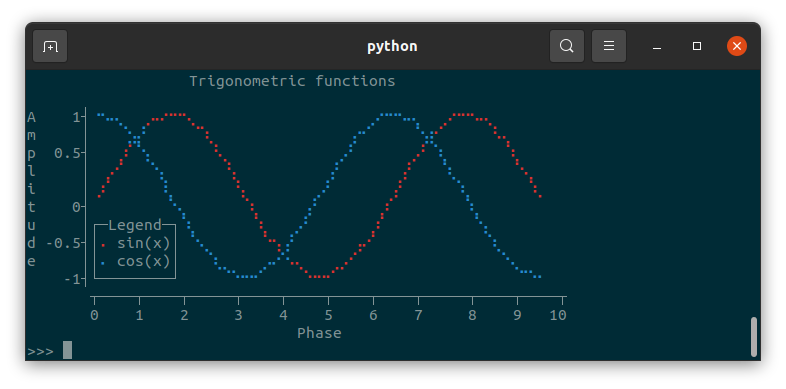
A more advanced example
import tplot
import numpy as np

x = np.linspace(start=0, stop=np.pi*3, num=80)

fig = tplot.Figure(
   xlabel="Phase",
   ylabel="Amplitude",
   title="Trigonometric functions",
   legendloc="bottomleft",
   width=60,
   height=15,
)
fig.line(x, y=np.sin(x), color="red", label="sin(x)")
fig.line(x, y=np.cos(x), color="blue", label="cos(x)")
fig.show()
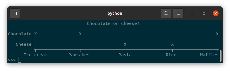
Categorical data
tplot supports categorical data in the form of strings:
import tplot

dish = ["Pasta", "Ice cream", "Rice", "Waffles", "Pancakes"]
topping = ["Cheese", "Chocolate", "Cheese", "Chocolate", "Chocolate"]

fig = tplot.Figure(height=7, title="Chocolate or cheese?")
fig.scatter(x=dish, y=topping, marker="X")
fig.show()
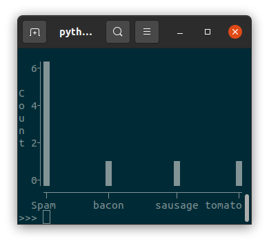
Numerical and categorical data can be combined in the same plot:
from collections import Counter
import tplot

counter = Counter(
   ["Spam", "sausage", "Spam", "Spam", "Spam", "bacon", "Spam", "tomato", "Spam"]
)

fig = tplot.Figure(ylabel="Count")
fig.bar(x=counter.keys(), y=counter.values())
fig.show()
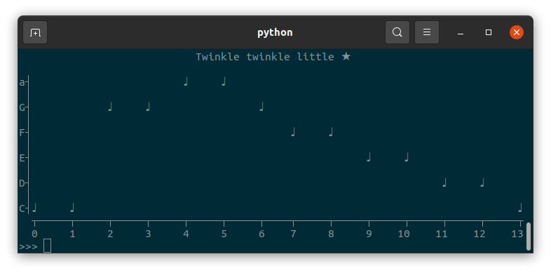
Markers
tplot allows you to use any single character as a marker:
import tplot

fig = tplot.Figure(title="Twinkle twinkle little ★")
notes = ["C", "C", "G", "G", "a", "a", "G", "F", "F", "E", "E", "D", "D", "C"]
fig.scatter(notes, marker="♩")
fig.show()
Warning
Be wary of using fullwidth characters, because these will mess up alignment (see Character alignment issues).
Images (2D arrays)
tplot can visualize 2D arrays using a few different “colormaps”:
import tplot
import numpy as np

mean = np.array([[0, 0]]).T
covariance = np.array([[0.7, 0.4], [0.4, 0.7]])
cov_inv = np.linalg.inv(covariance)
cov_det = np.linalg.det(covariance)

x = np.linspace(-2, 2)
y = np.linspace(-2, 2)
X, Y = np.meshgrid(x, y)
coe = 1.0 / ((2 * np.pi) ** 2 * cov_det) ** 0.5
z = coe * np.e ** (
   -0.5
   * (
      cov_inv[0, 0] * (X - mean[0]) ** 2
      + (cov_inv[0, 1] + cov_inv[1, 0]) * (X - mean[0]) * (Y - mean[1])
      + cov_inv[1, 1] * (Y - mean[1]) ** 2
   )
)

fig = tplot.Figure(title="Multivariate gaussian")
fig.image(z, cmap="block")
fig.show()
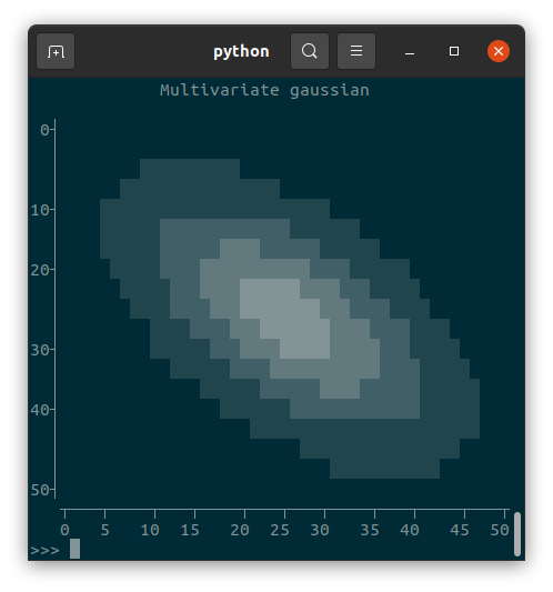
fig = tplot.Figure(title="Multivariate gaussian")
fig.image(z, cmap="ascii")
fig.show()
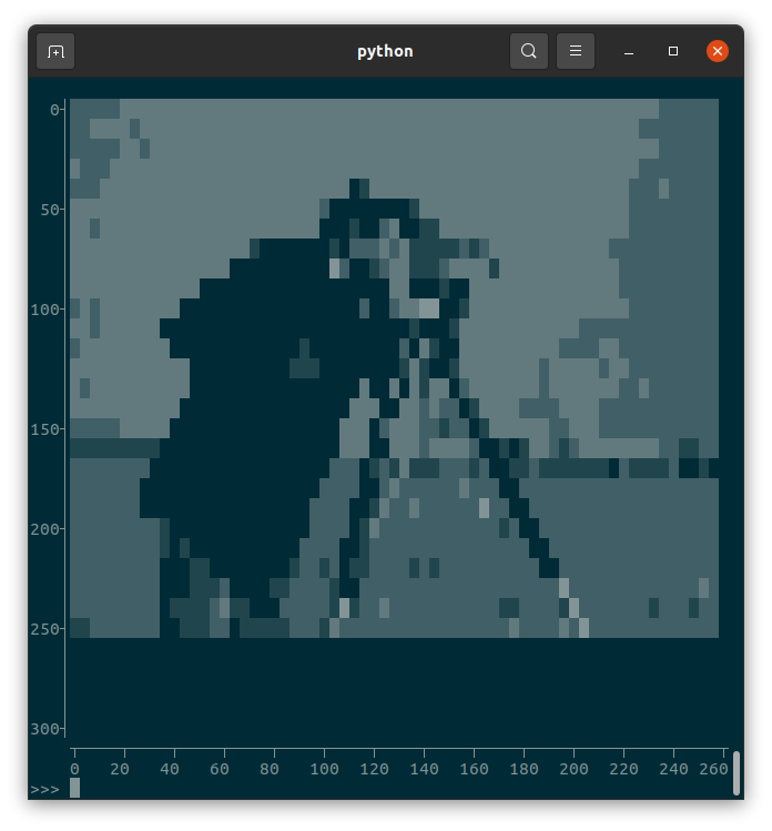
Images can also be shown, if first converted to a Numpy array of type uint8:
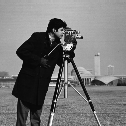
import tplot
from PIL import Image
import numpy as np

cameraman = Image.open("cameraman.png")
cameraman = np.array(cameraman, dtype=np.uint8)
fig = tplot.Figure()
fig.image(cameraman)
fig.show()
Formatting issues
Writing to a file and color support
You can get the figure as a string simply by converting to to the str type: str(fig)
However, if your figure has colors in it and you try to write it to a file (or copy and paste it from the terminal), it will look wrong:
                  Trigonometric functions                   \n                                                            \nA    1┤\x1b[34m⠐\x1b[0m\x1b[34m⠢\x1b[0m\x1b[34m⠤\x1b[0m\x1b[34m⡀\x1b[0m  \x1b[31m⡠\x1b[0m\x1b[31m⠤\x1b[0m\x1b[31m⠒\x1b[0m\x1b[31m⠒\x1b[0m\x1b[31m⠢\x1b[0m\x1b[31m⡀\x1b[0m                   \x1b[34m⡠\x1b[0m\x1b[34m⠒\x1b[0m\x1b[34m⠒\x1b[0m\x1b[34m⠢\x1b[0m\x1b[34m⠤\x1b[0m\x1b[34m⡀\x1b[0m  \x1b[31m⡠\x1b[0m\x1b[31m⠒\x1b[0m\x1b[31m⠒\x1b[0m\x1b[31m⠢\x1b[0m\x1b[31m⠤\x1b[0m\x1b[31m⡀\x1b[0m        \nm     │   \x1b[34m⠈\x1b[0m\x1b[34m⣢\x1b[0m\x1b[34m⡜\x1b[0m     \x1b[31m⠈\x1b[0m\x1b[31m⠱\x1b[0m\x1b[31m⡀\x1b[0m               \x1b[34m⡔\x1b[0m\x1b[34m⠊\x1b[0m     \x1b[34m⠑\x1b[0m\x1b[34m⣴\x1b[0m\x1b[31m
⠊\x1b[0m     \x1b[31m⠘\x1b[0m\x1b[31m⠤\x1b[0m\x1b[31m⡀\x1b[0m      \np  0.5┤   \x1b[31m⡰\x1b[0m\x1b[31m⠁\x1b[0m\x1b[34m⠑
\x1b[0m\x1b[34m⡄\x1b[0m      \x1b[31m⠘\x1b[0m\x1b[31m⢄\x1b[0m            \x1b[34m⢀\x1b[0m\x1b[34m⠜\x1b[0m      \x1b[31m⢀
\x1b[0m\x1b[31m⠜\x1b[0m \x1b[34m⠱\x1b[0m\x1b[34m⡀\x1b[0m      \x1b[31m⠱\x1b[0m\x1b[31m⡀\x1b[0m     \nl     │ \x1b[31m⢀\x1b[0m\x1b[31m⠔\x1b[0m\x1b[31m⠁\x1b[0m  \x1b[34m⠈\x1b[0m\x1b[34m⢢\x1b[0m       \x1b[31m⢣\x1b[0m          \x1b[34m⢠\x1b[0m\x1b[34m⠃\x1b[0m      \x1b[31m⢠\x1b[0m\x1b[31m⠃\x1b[0m   \x1b[34m⠱\x1b[0m\x1b[34m⡀\x1b[0m      \x1b[31m⠑\x1b[0m\x1b[31m⢄
\x1b[0m    \ni     │\x1b[31m⢀\x1b[0m\x1b[31m⠎\x1b[0m      \x1b[34m⢇\x1b[0m       \x1b[31m⢣\x1b[0m        \x1b[34m⡠\x1b[0m\x1b[34m⠃\x1b[0m      \x1b[31m⢠\x1b[0m\x1b[31m⠃\x1b[0m     \x1b[34m⠈\x1b[0m\x1b[34m⢆\x1b[0m      \x1b[31m⠈\x1b[0m\x1b[31m⢆\x1b[0m   \nt    0┤        \x1b[34m⠈\x1b[0m\x1b[34m⠢\x1b[0m\x1b[34m⡀\x1b[0m      \x1b[31m⠱\x1b[0m\x1b[31m⡀\x1b[0m     \x1b[34m⡜\x1b[0m       \x1b[31m⡰\x1b[0m\x1b[31m⠁\x1b[0m       \x1b[34m⠈\x1b[0m\x1b[34m⢆\x1b[0m          \nu     │┌─Legend─┐\x1b[34m⠱\x1b[0m\x1b[34m⡀\x1b[0m      \x1b[31m⠱\x1b[0m\x1b[31m⡀\x1b[0m  \x1b[34m⢀\x1b[0m\x1b[34m⠜\x1b[0m       \x1b[31m⡰\x1b[0m\x1b[31m⠁\x1b[0m         \x1b[34m⠈\x1b[0m\x1b[34m⢢\x1b[0m         \nd -0.5┤│\x1b[31m⠄\x1b[0m sin(x)│ \x1b[34m
⠑\x1b[0m\x1b[34m⢄\x1b[0m      \x1b[31m⠑\x1b[0m\x1b[31m⢢\x1b[0m\x1b[34m⢠\x1b[0m\x1b[34m⠃\x1b[0m      \x1b[31m⢠\x1b[0m\x1b[31m⠔\x1b[0m\x1b[31m⠁\x1b[0m            \x1b[34m⠱\x1b[0m\x1b[34m⡀\x1b[0m       \ne     ││\x1b[34m⠄\x1b[0m cos(x)│   \x1b[34m⠱\x1b[0m\x1b[34m⣀\x1b[0m    \x1b[34m⡠\x1b[0m\x1b[34m⠔\x1b[0m\x1b[34m⠑\x1b[0m\x1b[31m⠤\x1b[0m\x1b[31m⡀\x1b[0m   \x1b[31m⣀\x1b[0m\x1b[31m⠔\x1b[0m\x1b[31m⠁\x1b[0m               \x1b[34m⠈\x1b[0m\x1b[34m⠢\x1b[0m\x1b[34m⡀\x1b[0m     \n    -1┤
└────────┘     \x1b[34m⠉\x1b[0m\x1b[34m⠒\x1b[0m\x1b[34m⠒\x1b[0m\x1b[34m⠊\x1b[0m    \x1b[31m⠈\x1b[0m\x1b[31m⠒\x1b[0m\x1b[31m⠒\x1b[0m\x1b[31m⠊\x1b[0m                    \x1b[34m⠈\x1b[0m\x1b[34m⠉\x1b[0m\x1b[34m⠒\x1b[0m   \n       ┬─────────┬──
────────┬─────────┬──────────┬─────────┬\n       0         2          4         6          8        10\n                              Phase
This is because tplot uses ANSI escape characters to display colors, which only work in the terminal. Regular text files do not support colored text. If you want to write figures to a text file (e.g. for logging purposes), it is best to avoid the use of color.
Converting to HTML
You can use a tool such as ansi2html to format the figure using HTML:
from ansi2html import Ansi2HTMLConverter

conv = Ansi2HTMLConverter(markup_lines=True)
html = conv.convert(str(fig))
with open("fig.html", "w") as f:
   f.write(html)
But if you’re using unicode characters (such as braille), you will probably run into character alignment issues.
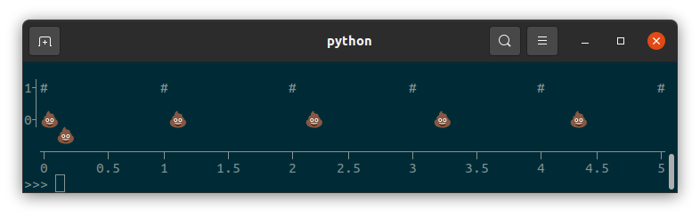
Character alignment issues
Fullwidth and halfwidth characters
tplot assumes all characters have a fixed width. Unless you’re crazy, your terminal uses a monospace font. But even for monospaced fonts, the wondrous world of unicode has three character widths: zero-width, halfwidth (so called because they are half as wide as they are tall) and fullwidth. Most characters you know are probably halfwidth. Many Asian languages such as Chinese, Korean, and Japanese use fullwidth characters. Emoji are also usually fullwidth.
Though fullwidth characters are exactly twice as wide as halfwidth characters, they still count as only one character. tplot will not stop you from using fullwidth characters, but it will mess up the alignment, potentially even causing lines to wrap around:
import tplot

fig = tplot.Figure(width=80, height=6)
x = [0, 1, 2, 3, 4, 5]
fig.scatter(x, y=[1, 1, 1, 1, 1, 1], marker="#")
fig.scatter(x, y=[0, 0, 0, 0, 0, 0], marker="💩")
fig.show()
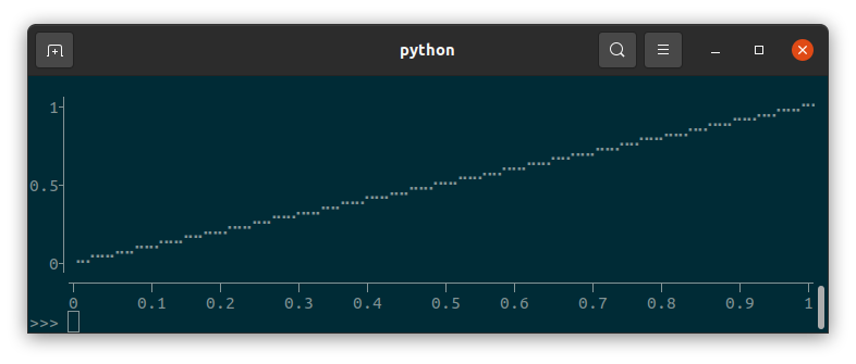
Braille
tplot can use braille characters to subdivide each character into a 2x4 grid (⣿), increasing the resolution of the plot beyond what is possible with single characters. However, not all monospace fonts display braille characters the same. In Ubuntu’s default terminal with the default Monospace Regular font, braille characters are rendered as halfwidth characters, so this will show a nice diagonal line:
import tplot

fig = tplot.Figure()
fig.line([0,1], marker="braille")
fig.show()
But many environments treat braille as somewhere in between halfwidth and fullwidth characters, leading to close-but-not-quite aligned plots:
  1┤                                                                      ⣀⣀⠤⠤⠔⠒
   │                                                            ⢀⣀⣀⠤⠤⠒⠒⠊⠉⠉
   │                                                   ⣀⣀⡠⠤⠤⠒⠒⠉⠉⠁
   │                                          ⣀⣀⠤⠤⠔⠒⠒⠉⠉
0.5┤                                ⢀⣀⡠⠤⠤⠒⠒⠊⠉⠉
   │                       ⣀⣀⡠⠤⠔⠒⠒⠉⠉⠁
   │             ⢀⣀⣀⠤⠤⠔⠒⠊⠉⠉
   │    ⢀⣀⡠⠤⠤⠒⠒⠊⠉⠁
  0┤⠐⠒⠉⠉⠁
   ┬───────┬──────┬───────┬──────┬───────┬──────┬───────┬──────┬───────┬──────┬
   0      0.1    0.2     0.3    0.4     0.5    0.6     0.7    0.8     0.9     1
API reference
- class tplot.Figure(xlabel: str | None = None, ylabel: str | None = None, title: str | None = None, width: int | None = None, height: int | None = None, legendloc: str = 'topright', ascii: bool = False, y_axis_direction: str = 'auto')
Figure to draw plots onto.
- Parameters:
xlabel – Label for the x axis.
ylabel – Label for the y axis.
title – Title of the figure.
width – Width of the figure in number of characters. Defaults to the terminal window width, or falls back to 80.
height – Height of the figure in number of characters. Defaults to the terminal window height, or falls back to 24.
legendloc – Legend location. Supported values are “topleft”, “topright”, “bottomleft”, and “bottomright”.
ascii – Set to True to only use ascii characters. Defaults to trying to detect if unicode is supported in the terminal.
y_axis_direction – Set to “up” to have Y axis point up (conventional for graphs), “down” to have Y axis point down (conventional for images). By default, this is automatically determined based on the drawn plots.
- scatter(x: Iterable | None = None, y: Iterable | None = None, marker: str = '•', color: str | None = None, label: str | None = None) None
Adds scatter plot.
- Parameters:
x – x data. If y is not provided, x is assumed to be y data.
y – y data.
marker – Marker used to draw points. Set to “braille” to use braille characters.
color – Color of marker. Supported values are “grey”, “red”, “green”, “yellow”, “blue”, “magenta”, “cyan”, and “white”.
label – Label to use for legend.
- line(x: Iterable | None = None, y: Iterable | None = None, marker: str = 'braille', color: str | None = None, label: str | None = None) None
Adds line plot.
- Parameters:
x – x data. If y is not provided, x is assumed to be y data.
y – y data.
marker – Marker used to draw lines. Set to “braille” to use braille characters.
color – Color of marker. Supported values are “grey”, “red”, “green”, “yellow”, “blue”, “magenta”, “cyan”, and “white”.
label – Label to use for legend.
- bar(x: Iterable | None = None, y: Iterable | None = None, marker: str = '█', color: str | None = None, label: str | None = None) None
Adds vertical bar plot.
- Parameters:
x – x data. If y is not provided, x is assumed to be y data.
y – y data.
marker – Marker used to draw bars. Set to “braille” to use braille characters.
color – Color of marker. Supported values are “grey”, “red”, “green”, “yellow”, “blue”, “magenta”, “cyan”, and “white”.
label – Label to use for legend.
- hbar(x: Iterable | None = None, y: Iterable | None = None, marker: str = '█', color: str | None = None, label: str | None = None) None
Adds horizontal bar plot.
- Parameters:
x – x data. If y is not provided, x is assumed to be y data.
y – y data.
marker – Marker used to draw bars. Set to “braille” to use braille characters.
color – Color of marker. Supported values are “grey”, “red”, “green”, “yellow”, “blue”, “magenta”, “cyan”, and “white”.
label – Label to use for legend.
- text(x, y, text: str, color: str | None = None) None
Adds text.
- Parameters:
x – x location (text is left-aligned).
y – y location.
text – Text to draw.
color – Color of text. Supported values are “grey”, “red”, “green”, “yellow”, “blue”, “magenta”, “cyan”, and “white”.
- image(image: ndarray, vmin: float | None = None, vmax: float | None = None, cmap: str = 'block') None
Adds image.
Note that this sets the Y axis direction to point down, unless y_axis_direction is set otherwise in Figure init.
- Parameters:
image – 2D array.
vmin – Minimum value covered by the colormap. Lower values are clipped. If set to None, uses 0 if the dtype of image is numpy.uint8 (usual for pictures), min(image) otherwise.
vmax – Maximum value covered by the colormap. Higher values are clipped. If set to None, uses 255 if the dtype of image is numpy.uint8 (usual for pictures), max(image) otherwise.
cmap – Colormap used to map image values to characters. Currently supported cmaps are “ascii” and “block”.
- clear() None
Clears previously added plots.
- show() None
Prints the figure.
Note that to get the figure as a string (to write to a file, for example), you can simply convert it to str type: str(fig)